Preventing A Crustacean Invasion
My Role: UX Design and Developer
Date: 2017
Partners: Washington Sea Grant Green Crab Team
Link: Preventing a Crustacean Invasion
About
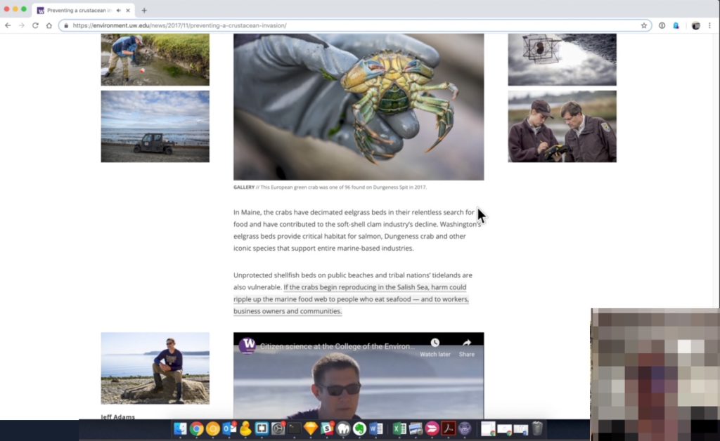
In 2016, the Green Crab Team at the University of Washington found one highly invasive European Green Crab on San Juan Island in the Salish Sea. The next year, their team of volunteers and scientists found 96 more in the Puget Sound and Strait of Juan de Fuca. To heighten awareness of this emerging threat to the Salish Sea ecosystem, our group published a “signature story” highlighting the team’s work.
Goals
- Tell a compelling story about the European Green Crab invasion in Puget Sound
- Clearly communicate the science behind the concerns over European Green Crabs
- Solicit donations from interested readers
Overall Process
- UW writers and photographers drafted a story and imagery focused on the invasion and volunteers that were collecting data.
- Using the draft article, we had lay people in our office (HR, assistants, etc.) come up with questions related to the piece.
- Brainstormed a set of story features that would answer those questions and make the article interactive.
- We sketched out a story with the interactive elements added where they make sense.
- I user tested the article with lay audience and scientists involved.
- I developed the article and we published it, and it became the most popular news article on our site.
Initial Assumptions
- The photography and videos are very strong and should be front and center in the article.
- Breaking up the article into smaller chunks with lots of white space helps readability.
- People might want to donate or volunteer.
Content Inventory
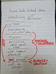
We worked with the writers to organize, reduce, and chunk out content from the story into different sections. We hoped that by breaking up the article it would feel less daunting and we would have more space for interactive features.
Likely Questions
On a quick timeline, we had folks in our office read the draft article and then tell us questions they still had after reading. These questions led us to which graphics we wanted to build. (I answered the questions in case you were wondering)
Most Common Questions
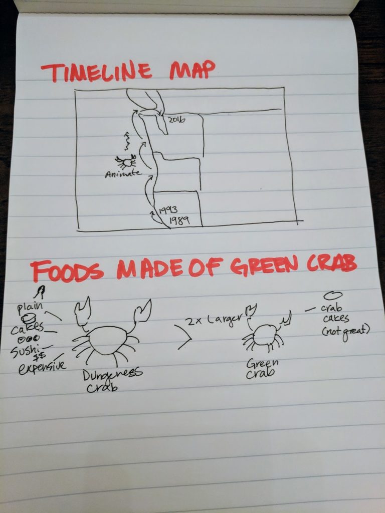
Why don’t we just eat the green crabs?
Answer: They’re smaller than the native Dungeness and less tasty. Some chefs use them for crab cakes.
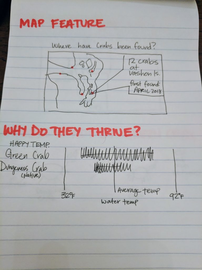
Why are they so well adapted, and why are we scared about Puget Sound when they’re already on the coast?
Answer: They can withstand a lot more environmental stress than the native Dungeness crabs, and as the climate warms the intertidal waters of the Sound, they’ll only do better.
Where have the crabs been found? Can I find them at my beachfront property?
Answer: So far only in the northern Puget Sound and Strait of Juan de Fuca.
Where else are they causing problems?
Answer: They’re really a global problem, but they’ve already colonized most of the US East coast and now they’ve been migrating up the US West Coast.
Sketching
Special Features
We worked on some rough sketches of the questions that we could answer with data. Not all the questions really could be.
Story Style
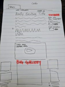
We wanted to modify our usual news format to show off the featured story. We sketched out an option with reduced clutter on the page, a larger column, larger text, and two sidebars for widgets, images, or interactive elements.
User Testing
Since we developed pretty clear ideas from the sketches and our time was limited, I started developing the site immediately. While it still had loose ends, I conducted user tests with some folks in the office who had read the story before, some new people who hadn’t, and some scientists who work with green crabs. I quickly realized we had issues with many of our interactive features and images – that they needed more instructions or prompting to get people to click, hover, and learn more. We tested with a small call to donate at the bottom, but all the folks we tested with didn’t even notice it.
Results
Revisiting Initial Assumptions
- The photography and videos are very strong and should be front and center in the article.
- Insight: Users needed additional prompting to zoom in on the photos and investigate, but adding a cue like the word “Gallery: tap to open” below did help.
- Breaking up the article into smaller chunks with lots of white space helps readability.
- Insight: Users were split on this technique. Some hated how much they had to scroll or swipe to get to the bottom, whereas some spent time looking through each image and feature.
- People might want to donate or volunteer.
- Insight: A few people we tested with were interested in how to volunteer or support the program, but many didn’t see the subtle calls.
New Discoveries
- Users did find the videos compelling on their own (12,000 plays on Facebook), but rarely played them through in the article.
- Users didn’t mind the idea of a bigger call to donate on the article, since it is a non-profit, social good.
- Some of our graphics had to be edited because scientists were worried that they weren’t accurate (crab didn’t have the right number of legs, the crabs didn’t necessarily march up the coast, etc.)
Final Product
User Experience Improvements
Adding small prompts to click and hover on the interactive features did encourage people to use them as I had imagined. We included a much larger image and call to action at the end of the story based on user feedback. I think that the addition of the interactive elements based on real questions was a serious improvement over the usual article/image format on news sites.
Development Notes
Since we wanted this toolkit to work with other “signature stories” on our website, I created a content blocking structure with shortcodes so that our content editors could edit and build stories like this themselves. We did this on another story a few months later called Field journal: Practicing geology in Big Sky Country.


