Future Students Landing Pages
My Role: UX Design and Developer
Date: 2016
Partners: Academic Affairs Team
Link: Future Undergraduate Students
About
One of the overall goals at the College of the Environment is for our programs to attract more undergraduate students. The Academic Affairs Team at the college came to our team asking for help updating their section of the site for student recruitment events.
Goals
- Create a more visually-engaging set of pages that tells the process of joining the College of the Environment
- Help students imagine what it is like to study the environment at the University of Washington
- Match the brand styles of the University of Washington and College of the Environment, yet create something different
Overall Process
- Work with Academic Affairs team, analytics, and new student focus group to find what information they would like to know when considering their major.
- Sort the different information into a process showing the progress you make from just interested to applying.
- Sketch wireframes of the new site, and build and fill a testing prototype with content
- Test prototype with students and make changes based on their findings.
- Launch the site using a new content type, pattern library, page templates, and custom fields that can be extended to similar information on other parts of the site.
Initial Assumptions
- Students aren’t sure which major they want to study, so we should show them.
- Prospective students would like to see other students’ paths.
- Most students who come to this page will be coming from within the UW.
Information Gathering
Analytics
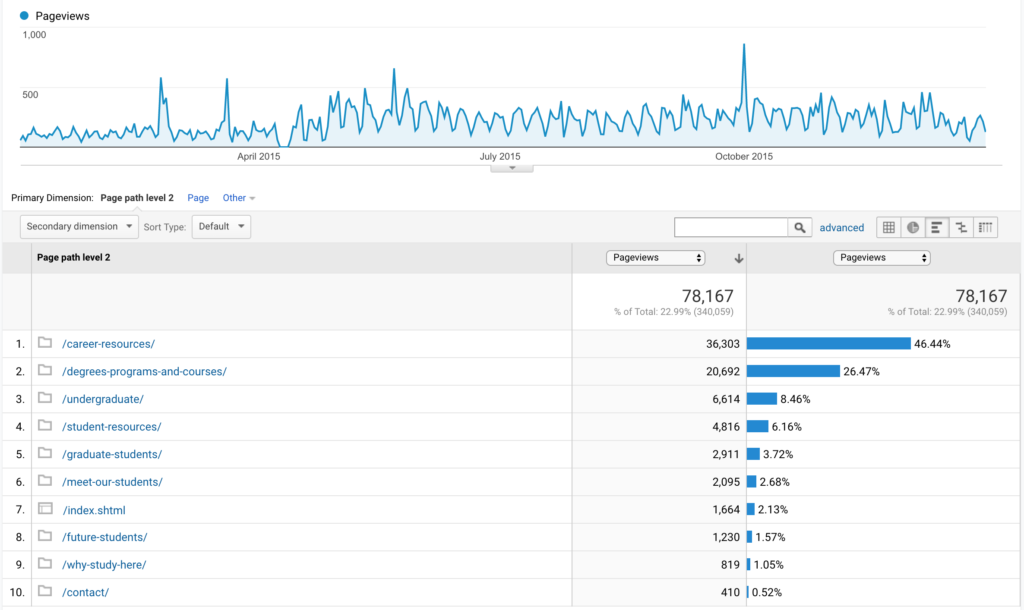
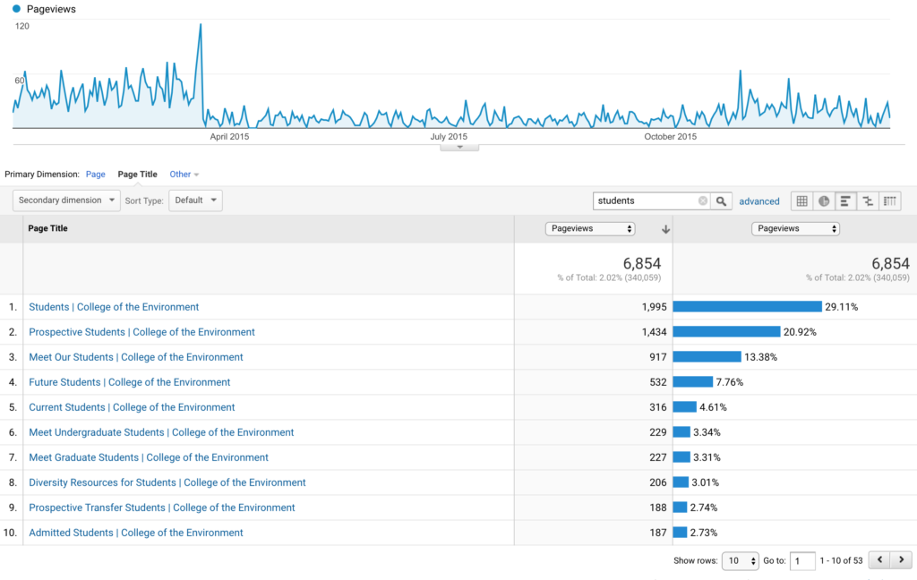
Grabbing data from Google Analytics, I determined which pages in the Students section were the most popular for our existing traffic, assuming that those options would be the most engaging for future students. Surprisingly the K-8 content and transfer student instructions were more popular than I had expected.
Focus Group
We brought in students that had recently declared their majors and advisors that had directed those students to declare. I explained what types of information we were thinking about putting in the section, and they discussed additional ideas.
- Why did you pick your program? Why though? Why? (asking this a few times in different ways got deeper answers)
- Did you use a website when considering what you would study?
- When comparing programs, what information made the biggest impact on your decision?
- What did you imagine yourself doing at the College of the Environment when applying?
- Did you consider other schools or programs?
Sketching and Wireframes
Next we sketched out and refined a simple wireframe with the content in the order we wanted it. These helped us realize when the page was too long, or what content would overlap. We also considered how the navigation and wayfinding in this section would work vs. the other pages on the site. We used these as a paper prototype for in-office testing.
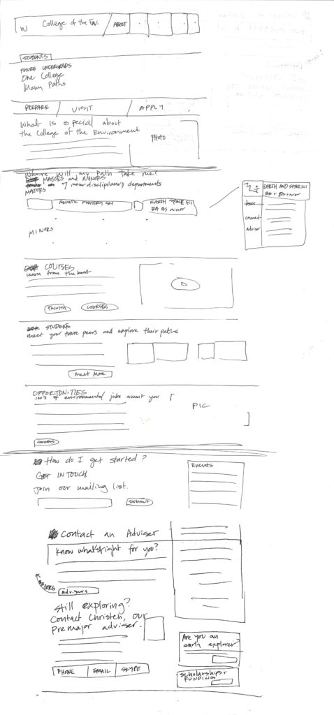
Rough sketch of first page 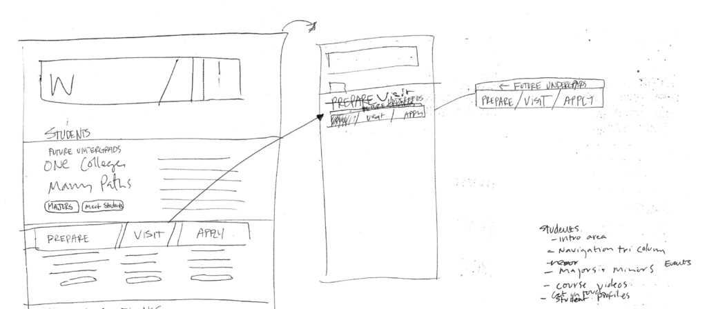
View of opening major accordion 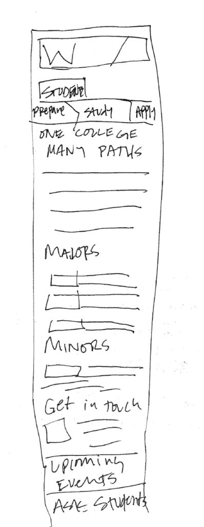
Quick sketch of mobile stack 
Hi-fi sketch of first page 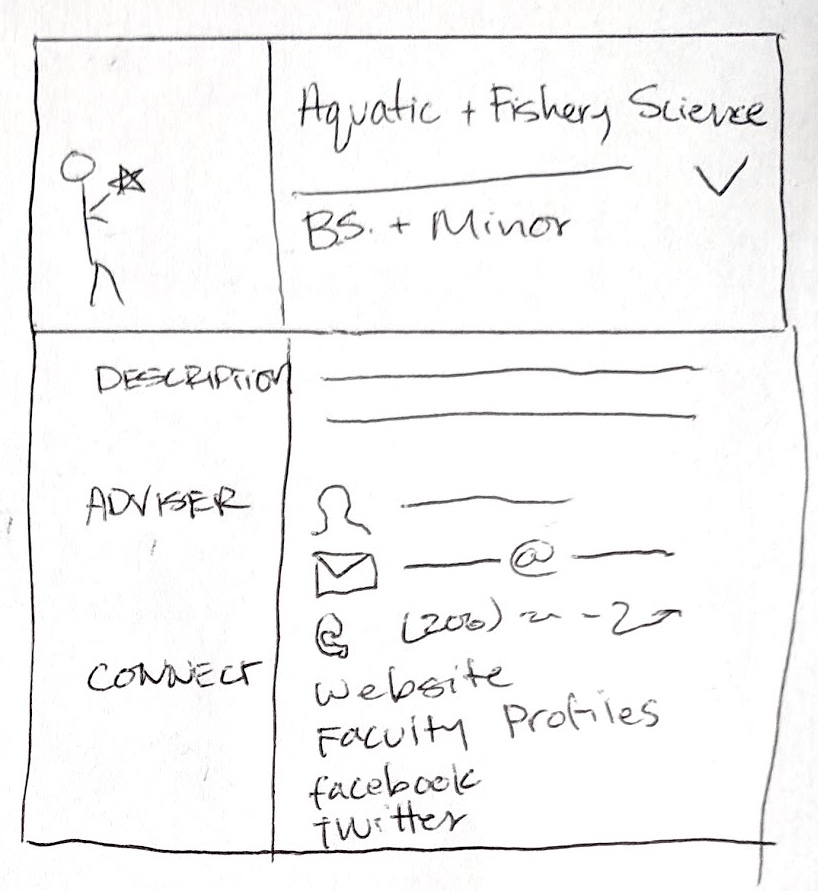
Detailed view of major accordion 
Mobile stack 
Secondary page navigation
Prototype and User Test
Building the prototype is standard for any updates we do on our college website, since we can use the basic template and insert the content before applying a design. The user test helped us realize what information was missing, irrelevant, or hard to find.
Results
Revisiting Initial Assumptions
- Students aren’t sure which major they want to study, so we should show them.
- Insight: Finding a major suited to them was the most common desire from students in the focus group.
- Prospective students would like to see other students’ paths.
- Insight: Prospective students cared less about knowing an active student’s path than knowing that they could identify with the active student.
- Most students who come to this page will be coming from within the UW.
- Insight: Analytics showed that a large number of prospective students were in a K-8 program or transfer students.
New Discoveries
- Students were often focused on one or two majors they had heard of rather than the full suite of majors offered from the college.
- Seeing a advisor’s face made them seem more approachable and students felt more likely to reach out.
- Many students not at UW wanted information on visiting campus with their parents.
Final Result
User Experience Improvements
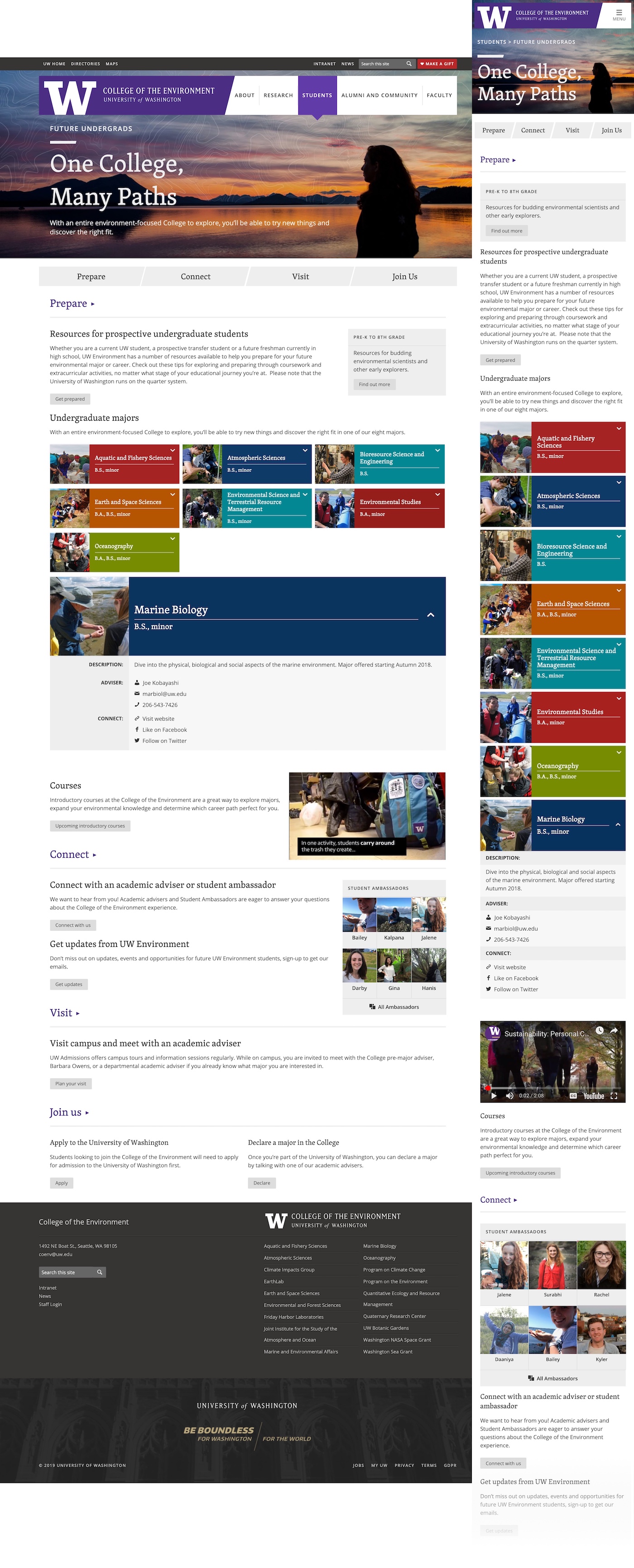
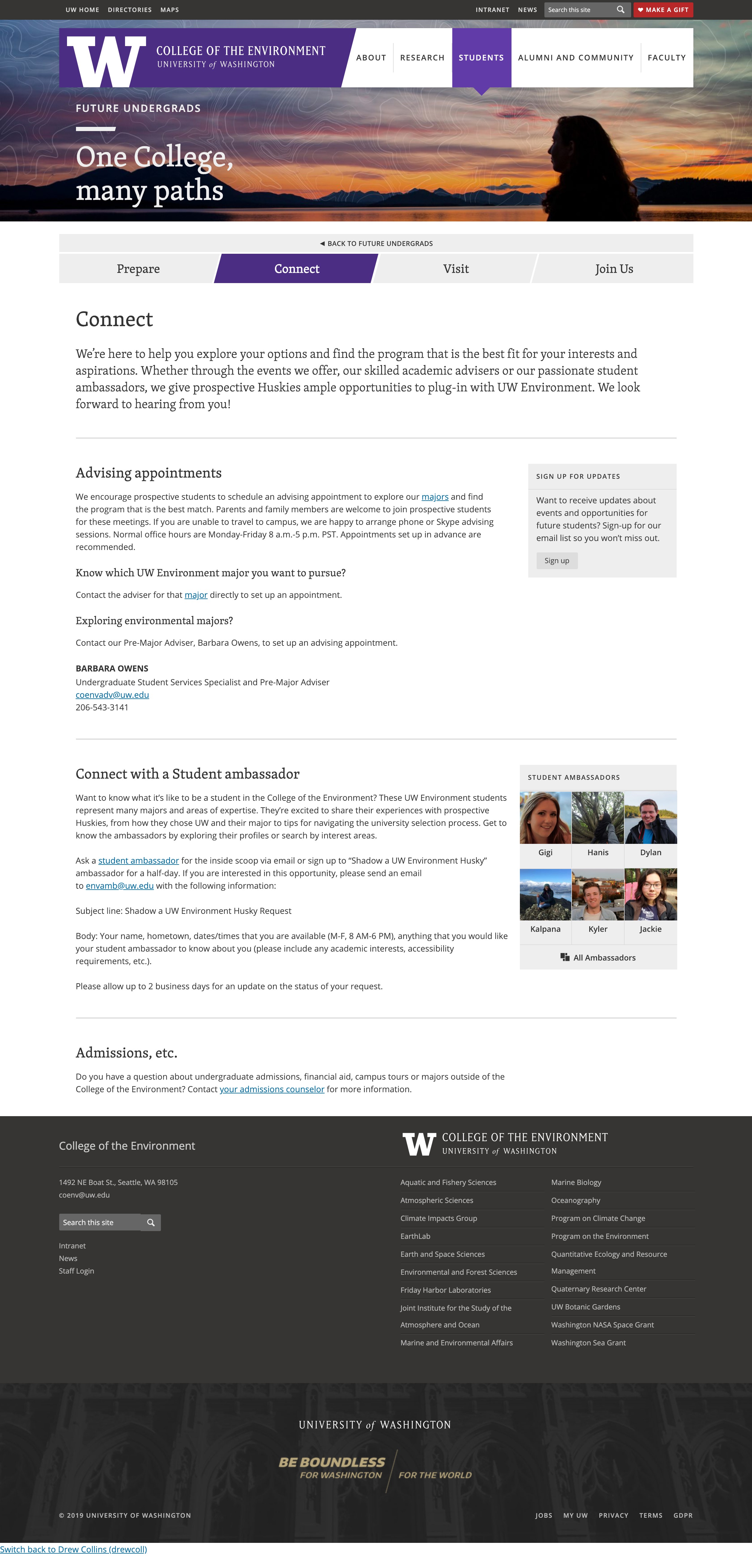
Since students getting to this set of pages are focused on future student content alone, typical navigation was removed to focus on the content. A new progress based navigation bar showed the steps to joining the College. We added a connect page with more information on contacting advisers and seeing students already in school. The colorful expanding tiles for majors don’t waste unnecessary space and allow students to focus on the programs they’re considering. The header image shows a silhouette allowing students to imagine themselves in the field—one of the best parts of studying the environment.
Development Notes
I built new templates for these pages that use custom fields to pull major information from other pages on our site. I also built a new searchable profile content type using the same accordions called student ambassadors which we link to from these pages.
