Friday Harbor Laboratories
My Role: UX Designer and Developer
Date: 2016-2017
Partners: University of Washington Friday Harbor Laboratories
About
The University of Washington’s Friday Harbor Laboratories (FHL) are a one-of-a-kind research station in the San Juan Islands off the northwest corner of Washington State. The labs are a destination for marine biology students and researchers from around the world. The location, community, and connection to the surrounding ecosystems set the labs apart from any others at the university. They came to our team and asked for a new website.
Goals
- Completely rebuild a new responsive website using modern web technologies and new “Boundless” branding
- Attract students and researchers by showcasing the unique setting and opportunities at the labs
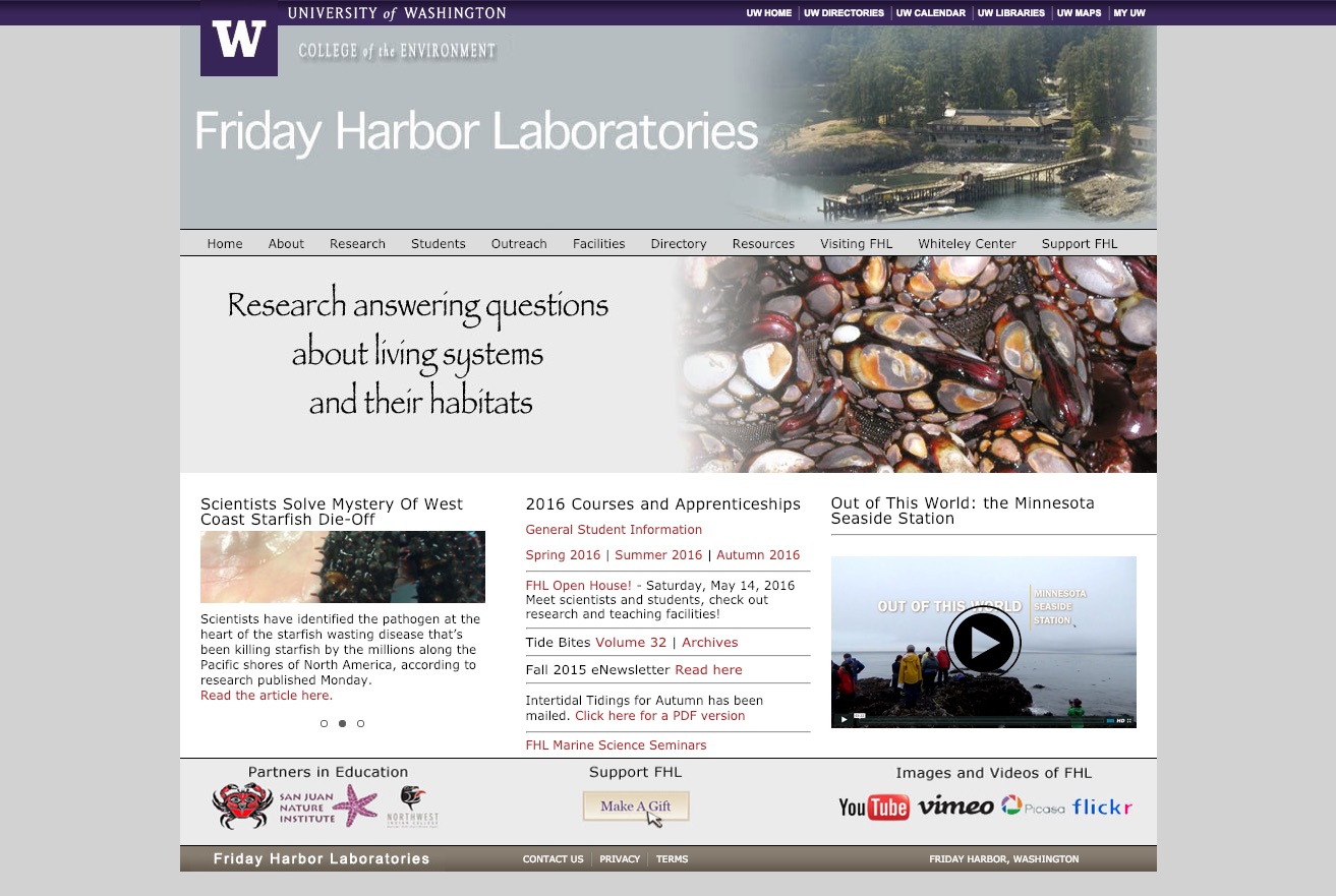
- Overhaul information architecture, user experience, and content of a decade-old website
Overall Process
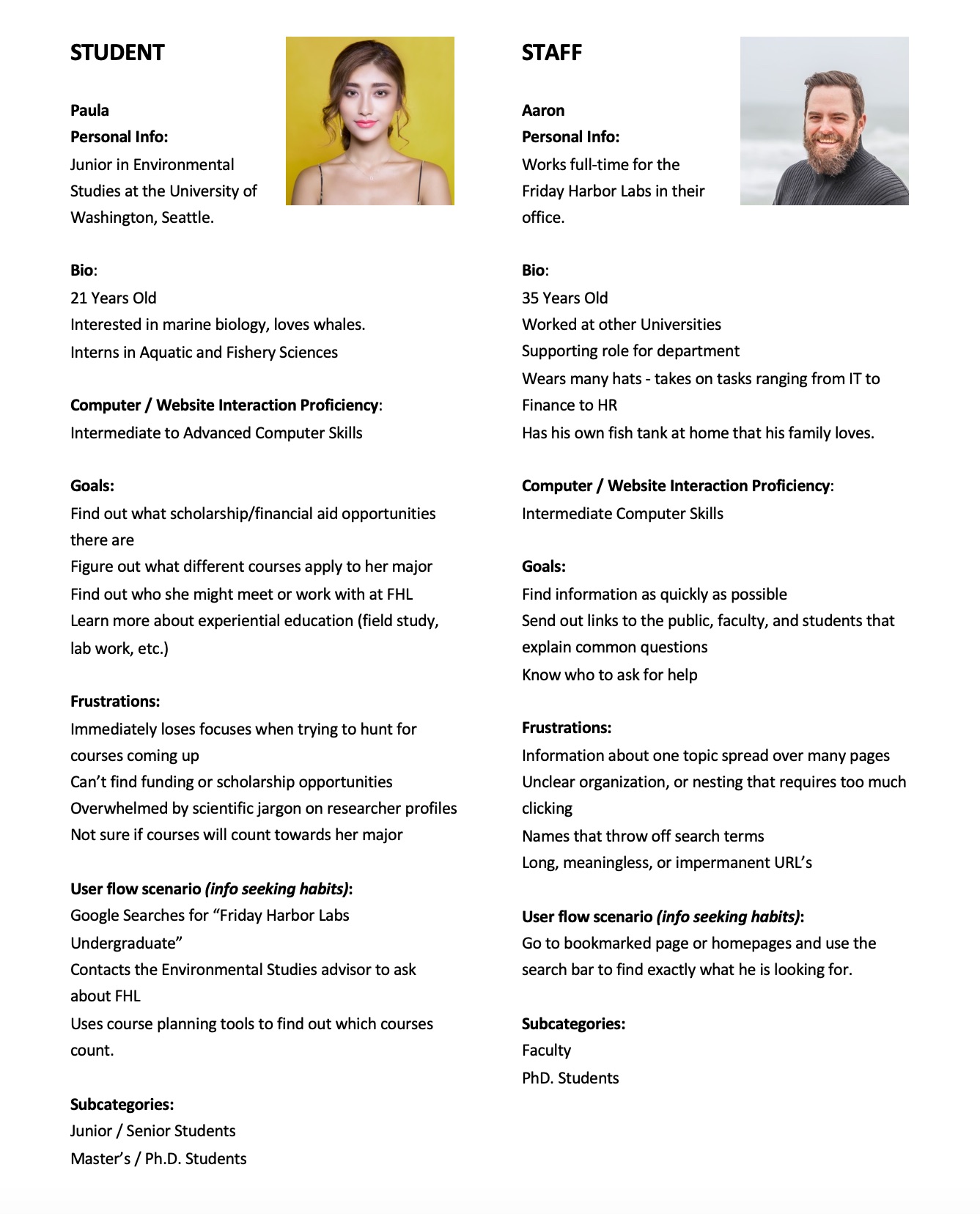
- At our kickoff meeting with the labs, our team developed personas, mapped critical user tasks, and prioritized content.
- Our notes led to a style tile and a basic prototype. We used the prototype and existing site to do testing and walkthroughs with students, advisers, and staff.
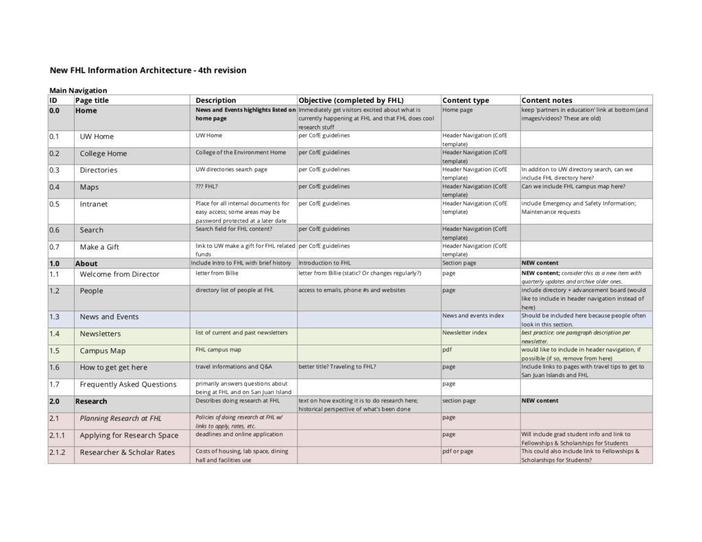
- We finalized a new information architecture that both consolidated and split up large sections of the old site to more closely match sites students were familiar with.
- To reinforce the setting, I created a looping homepage video showing what life is like at the labs.
- We completed and developed the design with new researcher, course, and news content types.
Initial Assumptions
- The site could show a lot more stunning imagery from the labs.
- The technology is outdated – the site seems to be living in a bounded box, and is not responsive or accessible.
- There are an overwhelming 11 top-line navigation items.
Brainstorm meeting
Since time was limited with the stakeholders at the labs, we did a half-day brainstorm session with lots of whiteboarding, post-it notes, and cards.
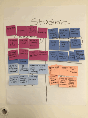
Personas
We used each of the core audiences of students, donors, and neighbors to discuss who might be in each group, what they might want to know, what questions they might have, and what they needed to be able to do when they reached the new website.
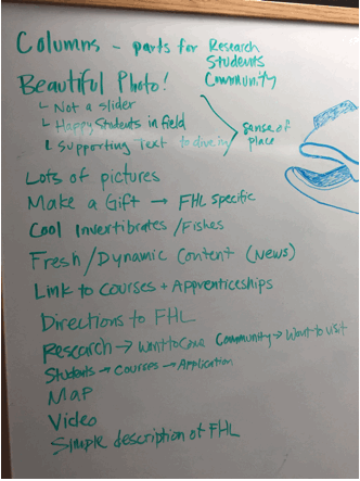
“Cereal Box” Exercise
If the website was a cereal box what would go on the front, the sides, and the back? What would go on the bottom? This prompt helped the group consider and prioritize content for the homepage of the new website. The sense of place at Friday Harbor Labs stood out as a very important nselling point to students and researchers. (There’s a whale head someone drew on the right)
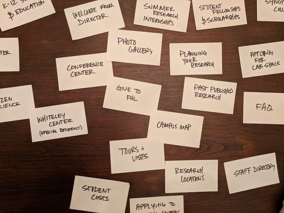
Card Sorting
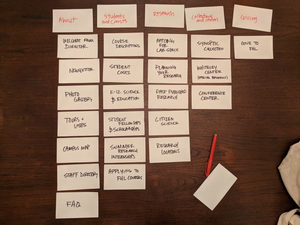
Since the information architecture needed to be revised, I made cards for each of the buckets of content originally outlined for the site. Folks were restricted to 5 buckets to fit the different pages into. They sorted the cards as they saw fit and we wrote down category names based on the sort.
The information architecture was later revised many times that led to our final revision.
User testing a prototype
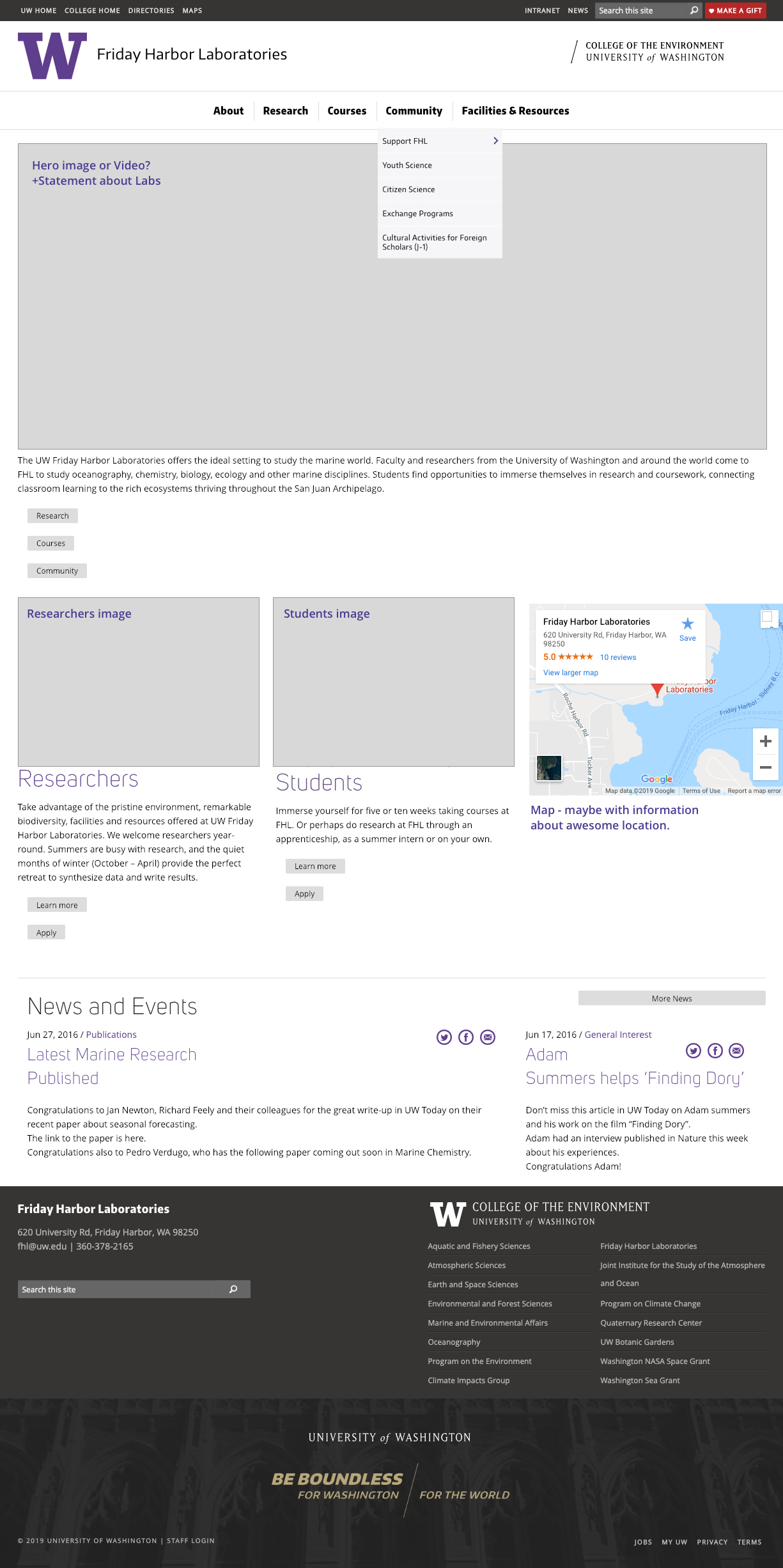
When most of the content was revised and put into these new buckets, I built a prototype which included a homepage layout based on our “cereal box” discussion earlier. We included a large homepage image, and talked about a homepage video, since as a photo says a thousand words, a video says more, and there’s lots of tranquil places we could show. The map would demonstrate where the labs were, and hopefully we could show their relation to Seattle and Vancouver (the nearest big cities).
Results
Revisiting Initial Assumptions
- The page could show a lot more stunning imagery from the labs.
- Insight: Needing better imagery was a common concern between stakeholders, students, and researchers.
- The technology is outdated – the page seems to be living in a bounded box, and is not responsive or accessible.
- Insight: In the user tests, students said the website “looked like it is fresh from 1999” and “I know this won’t work on my phone.”
- There are an overwhelming 11 top-line navigation items.
- Insight: It took users much longer to decide on what to click on the old menu vs. the new shorter menu.
New Discoveries
- When thinking about the student persona and their frustrations, we considered that they wouldn’t be able to see FHL courses the same way they would from other UW departments.
- The location was the biggest draw for researchers, students, and even staff.
- Creatures at the labs are very charismatic to marine biology enthusiasts (see the whale drawing on the whiteboard!)
Results
User Experience Improvements
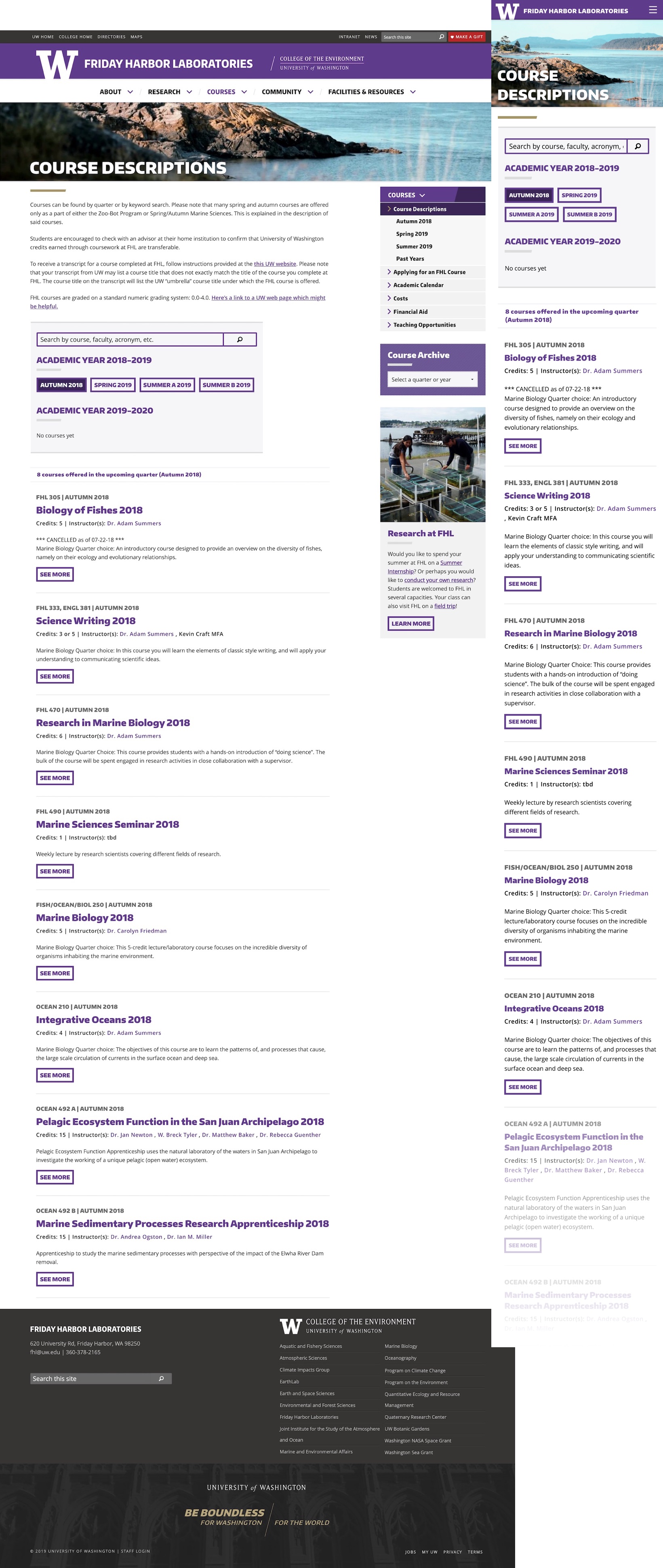
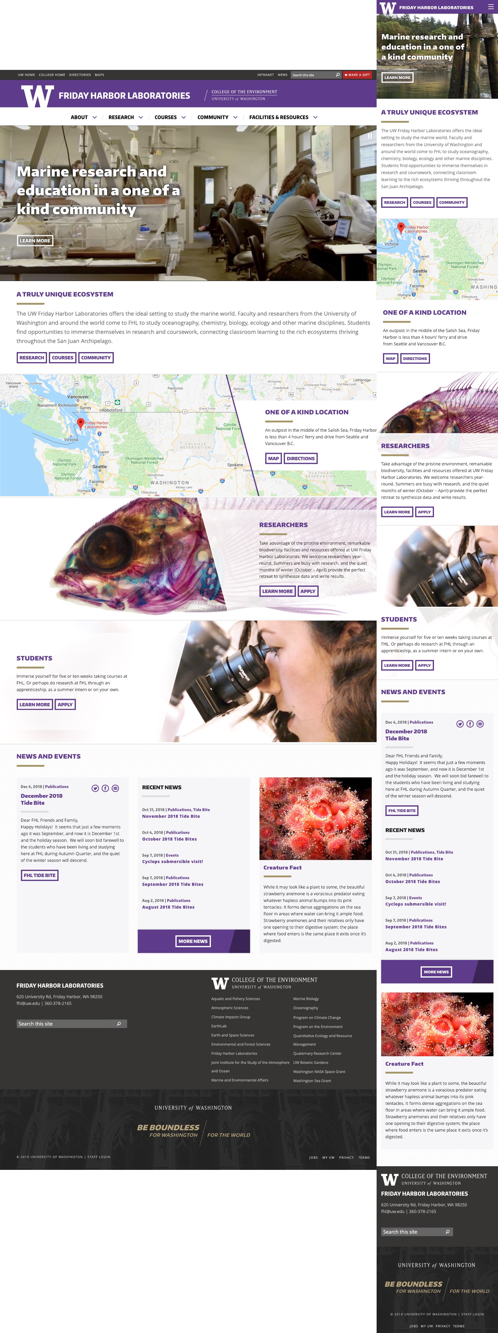
Working with the group, we reduced the total number of pages on the site and top-line menu items by half. Instead of a static homepage image, I edited an atmospheric, calm video montage of the labs which shows off the amazing location. Based on the feedback from students, we built a course tool which shows all the courses hosted by different university departments that you can take at Friday Harbor. On the homepage we included a “Creature Fact” section to show off some of the flora and fauna of the San Juan Islands.
Development Notes
The site is now responsive, accessible, and modern. The video was a fun project, since I had to work hard to compress it under 3 MB and keep the quality acceptable. For mobile breakpoints the video does not load to save data. I embedded a Google Map that focuses on the relation of the labs to Seattle at all screen sizes.
Homepage
Courses Page
