Chowmart Checkout
My Role: UX Design and Branding
Date: 2017-2018
Partners: Chowmart Team
About
Many people were shocked when Amazon debuted their Amazon Go grocery store concept in 2016. Were the frustrating problems of self-checkout machines at grocery stores solved? Possibly – yet Amazon’s solution involved thousands of cameras, special lighting, and baffling technology. I worked with a small team, in a UX class at first, to think about what self-checkout could be like with a simpler, more economical improvement. We called our product “Chowmart.”
Goals
- Streamline the self-checkout experience at a major grocery store
- Make an intuitive process that everyone can use, or learn to use
- Develop a product that is likely to cost less than the Amazon Go system
Overall Process
- Our team observed 100 checkouts and interviewed 9 people at local grocery stores using or staffing self-checkout machines.
- We conducted an affinity mapping exercise using notes and phrases from the interviews to find out what people commonly thought about self-checkout.
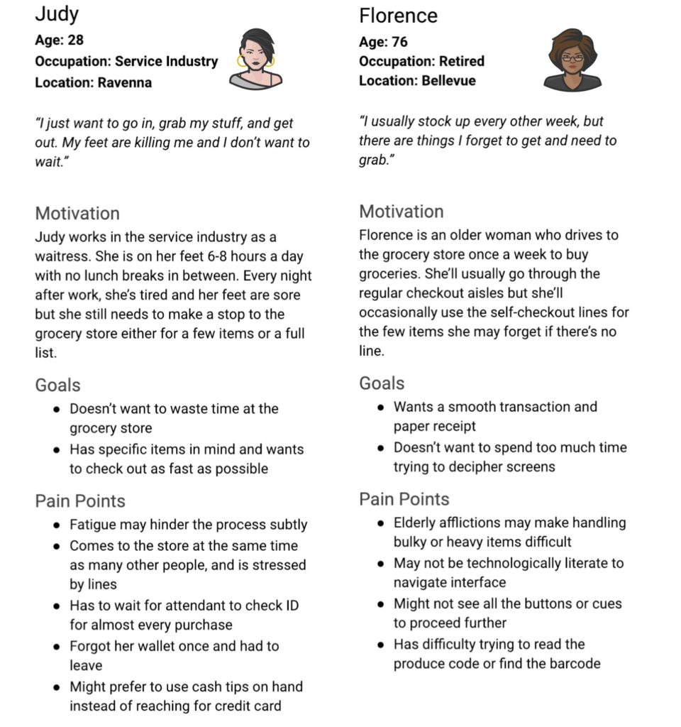
- I built personas based on the users interviewed and observed.
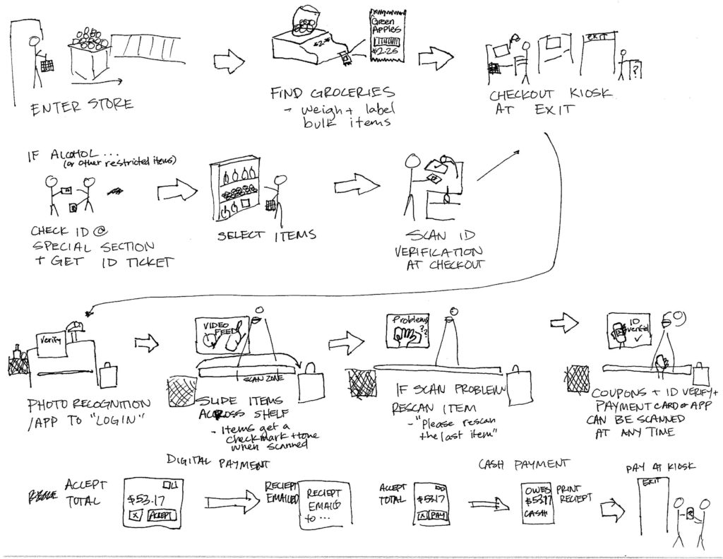
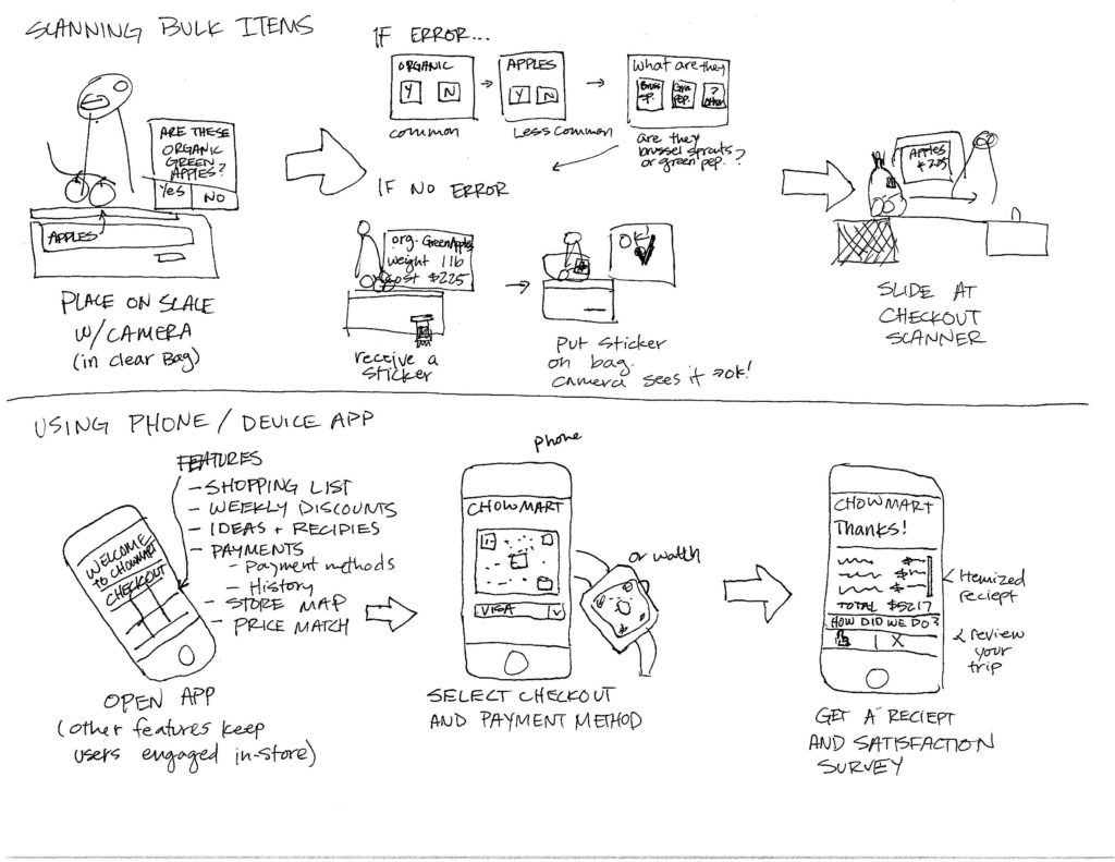
- I created storyboards and a user flow for a streamlined self-checkout process.
- I developed a physical and touch prototype and tested it on friends.
- I designed an interface based on previous findings.
Initial Assumptions
- The checkout software looks outdated, skeuomorphic, and is annoying which makes people feel like self-checkout is inferior to the checkstand.
- The machines often fail when the scale is tipped or for unknown reasons.
- Having the payment screen totally separate is strange.
Observations and Interviews
Our team fanned out to 8 different stores with self-checkout machines and observed 100 interactions with the machines.
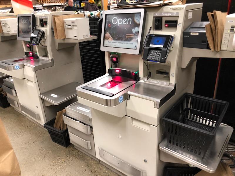
We found that the most common frustrations were:
- The bagging area scale leads to the most problems.
- Less than 15% of customers bag their groceries immediately, instead waiting until they are done.
- Coding in weighed items like bulk foods or produce takes the longest time.
- Customers judge each other while in line, and feel rushed and judged while they are scanning.
- Customers don’t pick up their receipts, leaving trash around the machines.
- Not enough attendants per machine.
- Machines are inconsistent from store to store.
- When there is an issue the machine doesn’t tell you what is wrong, simply “An attendant has been notified to assist you.”
Personas
Brainstorm
- What parts of this experience could we replace with your own device?
- Which repetitive tasks can be removed by having the machine remember you?
- Could we move time consuming parts of the process away from the payment step at the store?
- Can we make the machine tell you what is wrong?
- Would we require customers to use electronic payment and a user account? Is that exclusive?
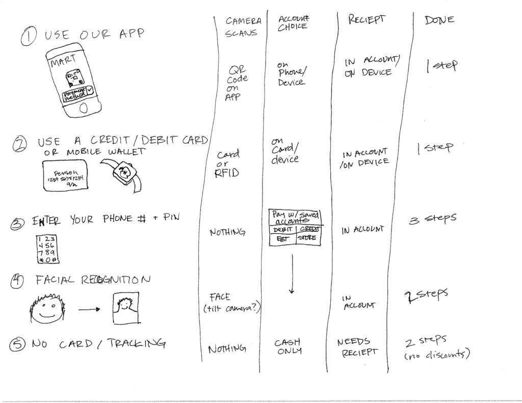
Storyboarding
I created storyboards for our team where we distilled different steps that would lead to a more streamlined store experience.
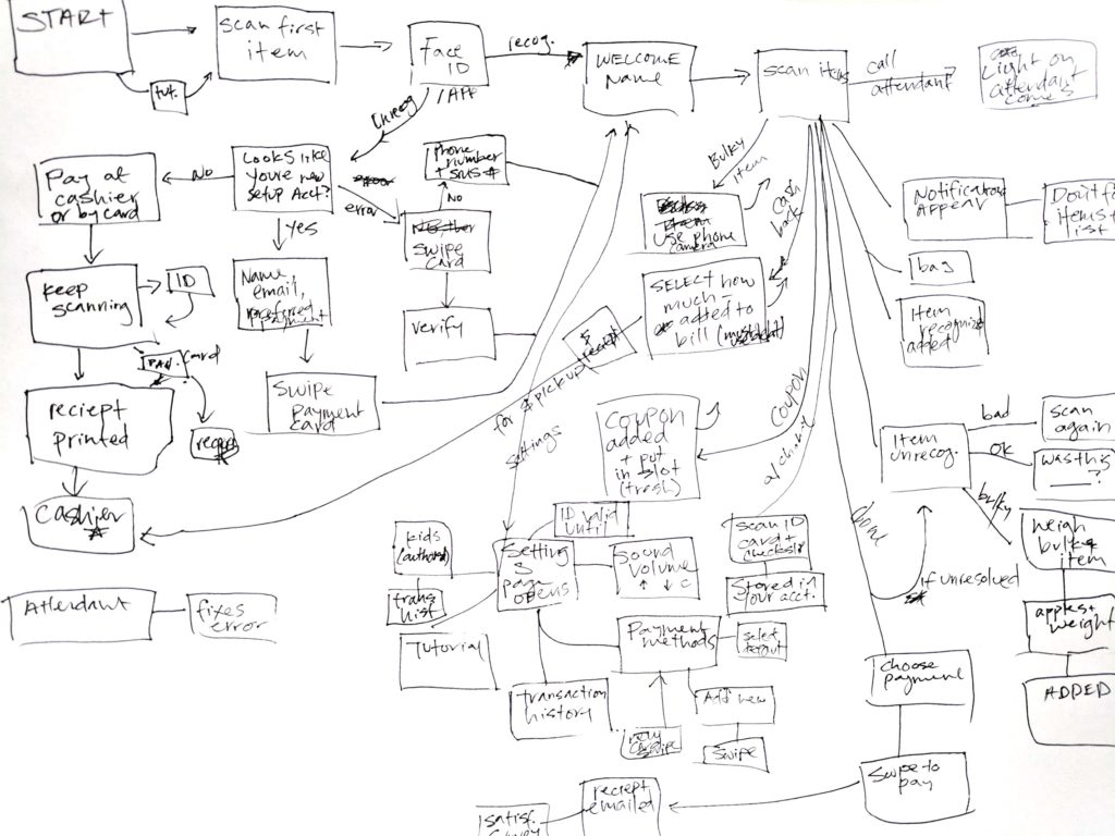
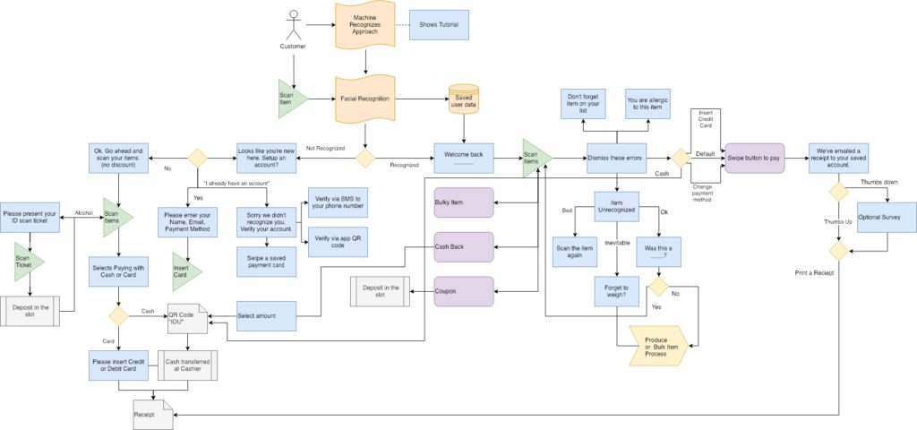
User Flow
Started as a quick whiteboard exercise, the user flows on this project became very complicated. I looked at user flows for the app, bulk item weighing, settings screen, attendant screen, and checkout process. These flows were super helpful in realizing how much work each part would need.
Prototype and User Tests
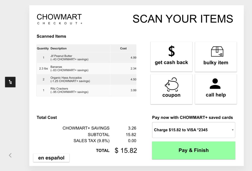
We built a prototype in UX Pin and tested it on folks in our class, friends, and a few strangers.
Results
Revisiting Assumptions
- The checkout software looks outdated, skeuomorphic, and is annoying which makes people feel like self-checkout is inferior to the checkstand.
- Insight: The look of self-checkout is the surface of the problem. More than 30% of people using self-checkout need assistance while they’re using it.
- The machines often fail when the scale is tipped or for unknown reasons.
- Insight: Problems derived from the scale are the most common.
- Having the payment screen totally separate is strange.
- Insight: When interviewing store employees we found that the payment screen is kept separate to modularize the machine.
New Discoveries
- We observed that most people do not use the bagging area to bag.
- Most people do not scan their “club card” but instead use their memorized phone number.
- The amount of options the self-checkout machine screen needs to display increases greatly when all kinds of payment methods and ID verification are considered.
- The psychological component of feeling rushed during checkout and judging others is just as daunting and upsetting to users as the technology.
Final Product
User Experience Improvements
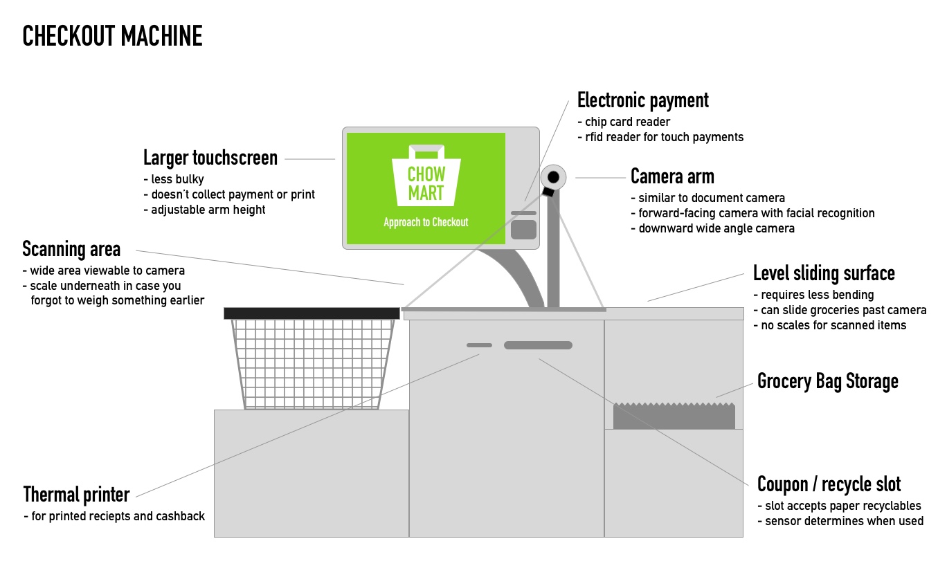
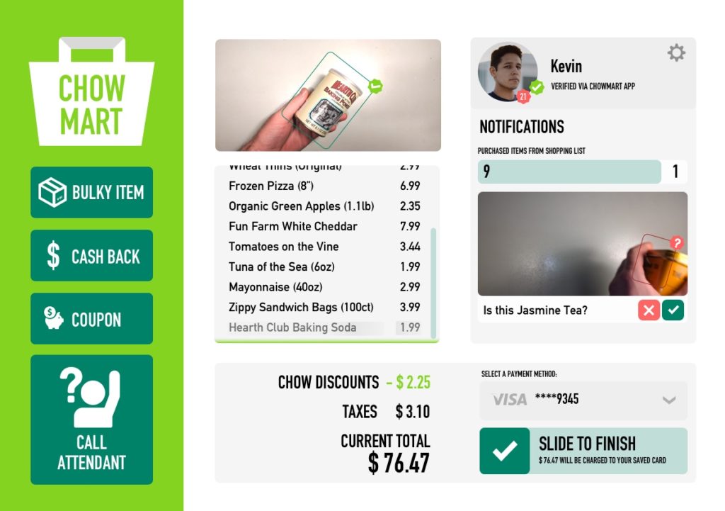
To improve the experience, we settled on using image recognition technology, but only at the checkstand and bulk item weighing station. Our team focused on keeping bulk weighing and ID checking away from the self-checkout machine, since they delay folks the most. By using saved data, we could tell users what they forgot, what they bought last time, or even what recipes they could cook with the food they purchased. Our store concept could serve everyone that a standard grocery store today, yet utilize the time-saving technologies being pioneered in the space.
Branding and Visual Design
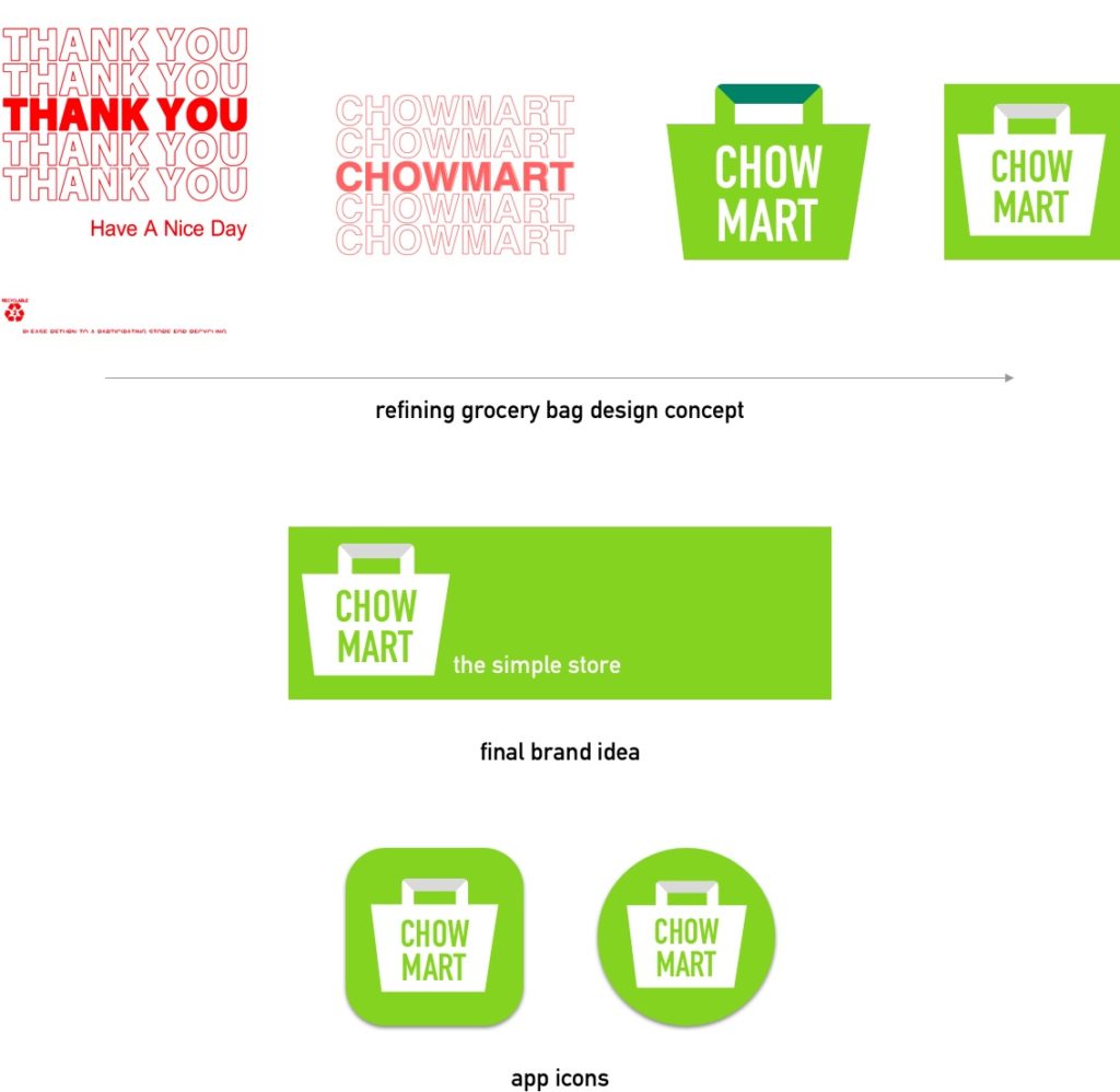
For the final designs, I worked to create a friendly, simple design focused on the casual atmosphere of our store. I was inspired by the idea of a grocery bag, and went to the color green to indicate freshness and savings.
