Career Opportunities Tool
My Role: UX Design and Developer
Date: 2016-2017
Partners: Academic Affairs Team
About
The College of the Environment’s Career Opportunities page posts hundreds of job listings each month for thousands of students at the University of Washington. As one of the most popular pages on our website, I conducted a usability update to make the biggest impact for the most people.
Goals
- Increase student satisfaction, and visits to the career opportunities page
- Improve accessibility, speed, visual appeal, and ease-of-use of existing popular resource
- Streamline student assistant data-entry
Overall Process
- We set up a survey and advertise it on the existing page with a attention-grabbing widget block.
- I used analytics to determine which user flows and filters are the most popular. With the client team, I pared down taxonomies.
- I built a functional prototype which incorporated the most requested features and usability improvements.
- I user tested student survey-takers with existing site and prototype to find additional improvements.
- Finally, I developed a new page from prototype using PHP, SASS, and Javascript. I built a new search tool and sticky filters with infinite post loading. I overhauled site accessibility and used aria-roles for DOM updates.
Initial Assumptions
- The tool is hard to use because the filters are too long and too far down on the page.
- The filters and search should work together, and not require a page reload.
- The job opportunities themselves have one big level of text making the page longer than it needs to be and ugly.

User Survey
To test the assumptions and answer questions about the tool, I developed a survey aimed at our core audience – students and alumni of the UW College of the Environment.
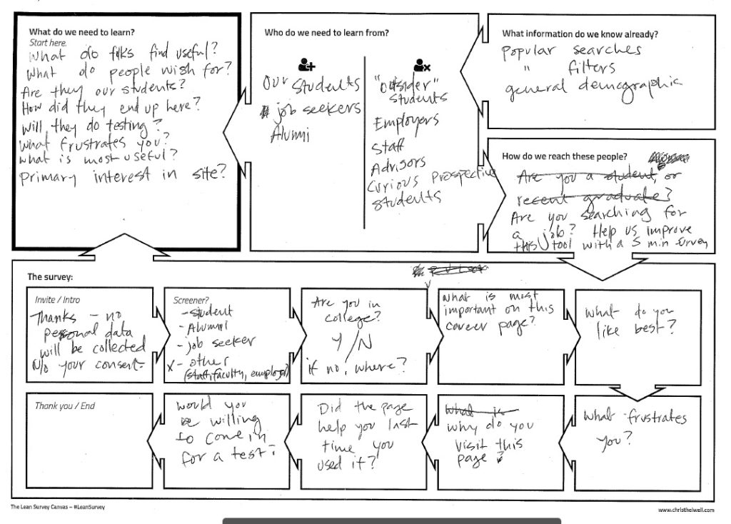
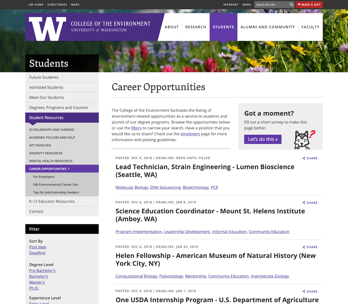
I added a widget to the right side of the page for a few weeks featuring a cute animated GIF of our mascot, Dubs the Husky to attract attention to the survey.
Then I took a look at the results. Paradoxically, respondents said that they would prefer to use a filter to go from page to page, while analytics showed that they most often clicked from page 1 to page 2 to page 3 (without filtering). Below is an excerpt of the survey results.

Analytics
I used Google Analytics and post frequencies to find which categories, keywords, and filter terms were most popular. I also looked at basic demographic data and how many users used the filters vs. search box vs. tabbed from page to page. From this list we consolidated the filter categories and found that people rarely if ever clicked on the tags below each listing.

User testing a prototype
Sketching
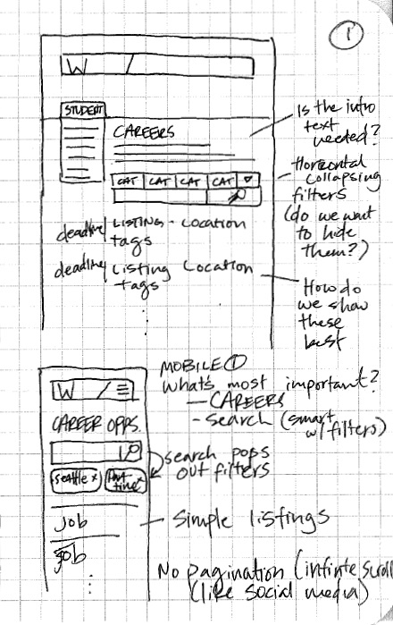
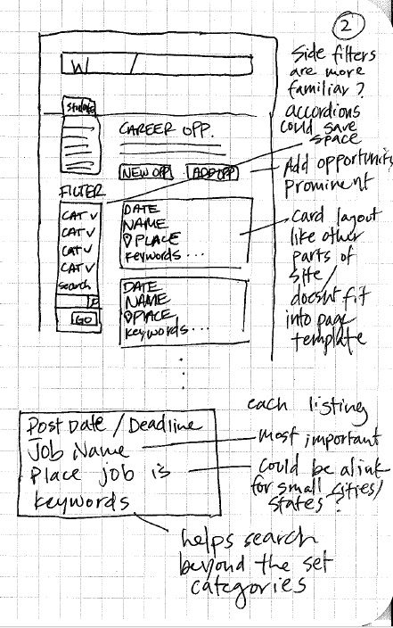
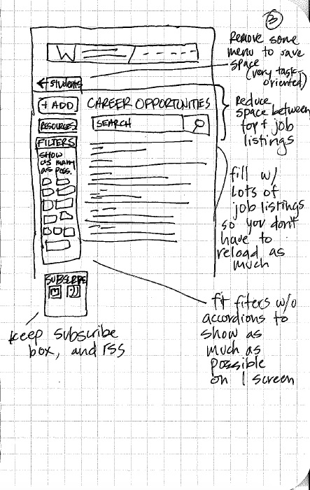
Next I did some sketches and brainstorming of how I would improve the layout and functionality to meet users’ feedback from the survey.
User Testing
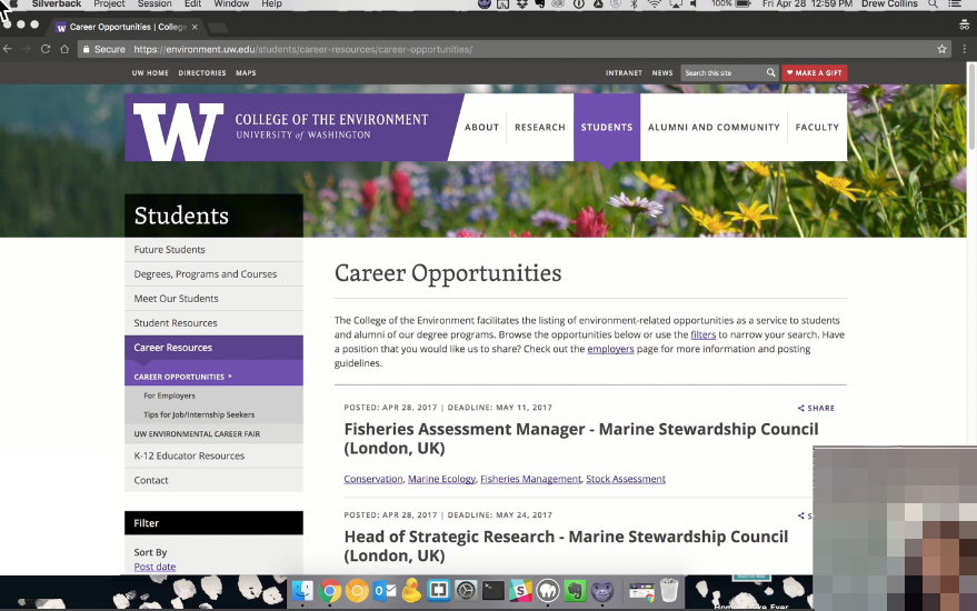
I recorded while interviewing users as they used the old site and a new prototype I built. I found that when they were serious, they would visit this site multiple times per week on a desktop or laptop and scroll through hundreds of listings.
Results
Revisiting Initial Assumptions
- The tool is hard to use because the filters are too long and too far down on the page.
- Insight: The survey and analytics show that most users would like to use the filters, but instead tab from page to page.
- The filters and search should work together, and not require a page reload.
- Insight: On many of the survey responses and during the user tests on the old page, this was a common frustration.
- The job opportunities themselves have one big level of text making the page longer than it needs to be and ugly.
- Insight: The user tests seemed to indicate that page length didn’t bother students, but they did have trouble always seeing the full job title and location quickly.
New Discoveries
- Analytics showed that tags under each listing are not used very often. User testing showed that people found it frustrating when they would click on the tag and only get the result they had originally seen. However, users found the tags helpful to get more details about the listing (Field Biologist could be in the ocean or the desert, and the tags help with that)
- Users would like to be able to subscribe to a set of filters.
- Frequent visitors would like to see which postings are new since their last visit.
- Most people who go to this page only visit this section of the College website, so the side menu and wayfinding are less relevant, and wasted space.
Final Product
User Experience Improvements
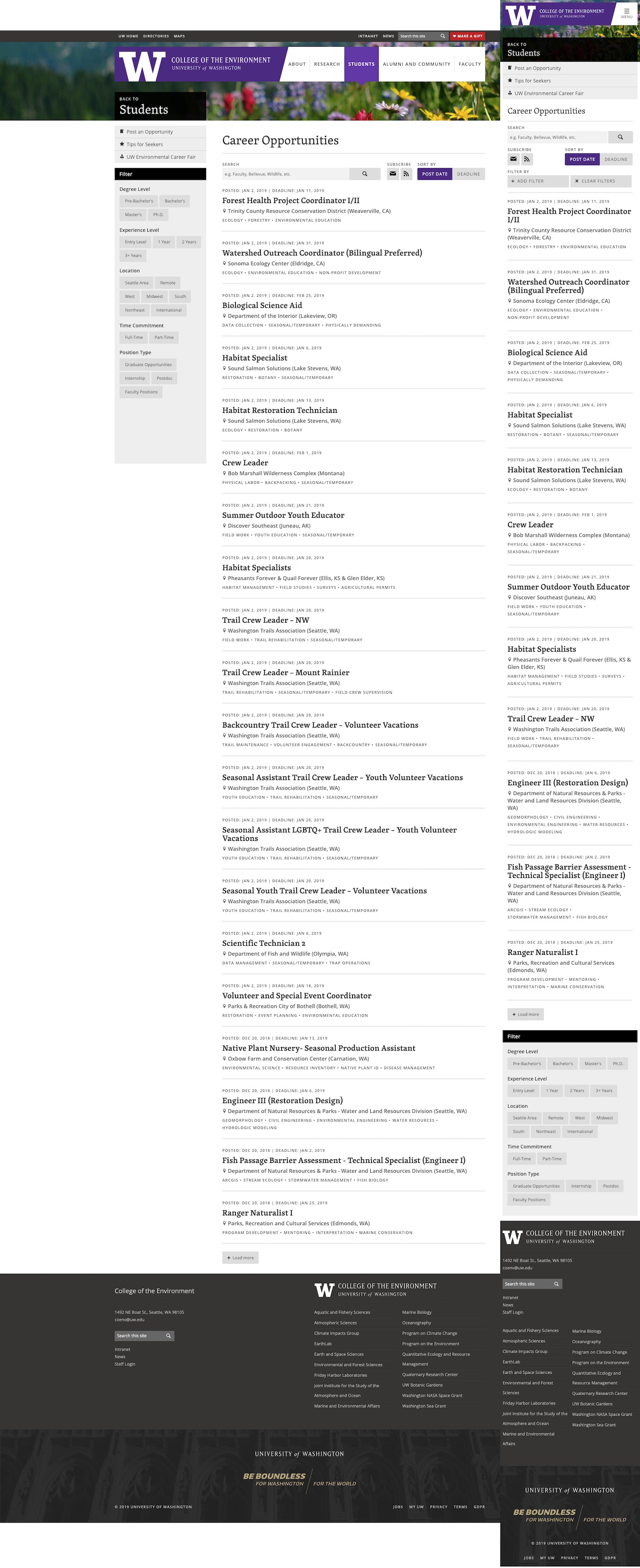
The final update from the process reduced the menu to only relevant choices and filter sizes on the right to fit within the typical vertical area of a desktop monitor. The filters stick as you scroll down the page. Filters apply without page reloads and you can do multiple at once. The search box is no longer hidden under the huge list of filters, and is much larger. I added code that would star new listings since your last visit, so you don’t have to guess about what you’ve seen.
Development Notes
I used AJAX to make the filters live update when users selected multiple filters. It then populated the area under the search box with the filtered terms. The previously viewed posts was achieved using the browser’s LocalStorage and the timestamp. To maintain WCAG 2.0 accessibility, I added ARIA roles for the DOM updates. I replaced pagination with a simple “Load more posts” button that appends posts to the end of the feed. The page is mobile optimized so that a scroll effect takes you down to the filters when clicking on the filter button and back to the top when filters are selected.
